Your homepage is the most important page on your website — and for most small businesses, it’s also the most underperforming one. Visitors decide within seconds whether to stay or leave, and most homepages fail to answer the questions that matter most: What do you do? Who do you serve? And why should I choose you over everyone else? Getting the must-have elements on a small business homepage right isn’t about making something that looks impressive — it’s about making something that converts visitors into customers. At Indy Blitz, we’ve been designing and building websites for Indianapolis-area businesses since 2009, and we’ve seen firsthand what works and what causes potential customers to quietly click away. Here’s what your homepage needs to do the job.
Your Homepage Has One Job — and Most Small Business Sites Don’t Do It Well
Before diving into specific elements, it helps to understand what a homepage is actually supposed to accomplish. It’s not a brochure. It’s not an art project. It’s not a place to dump every piece of information about your business.
A small business homepage has one core job: to take a visitor who arrived with a question or a need and move them confidently toward taking action — calling, booking, buying, or inquiring. Everything on the page should serve that purpose. Elements that don’t contribute to it are noise that distracts from your goal.
With that frame in mind, here are the elements that genuinely belong on a high-performing small business homepage.
The Elements Every Small Business Homepage Must Include
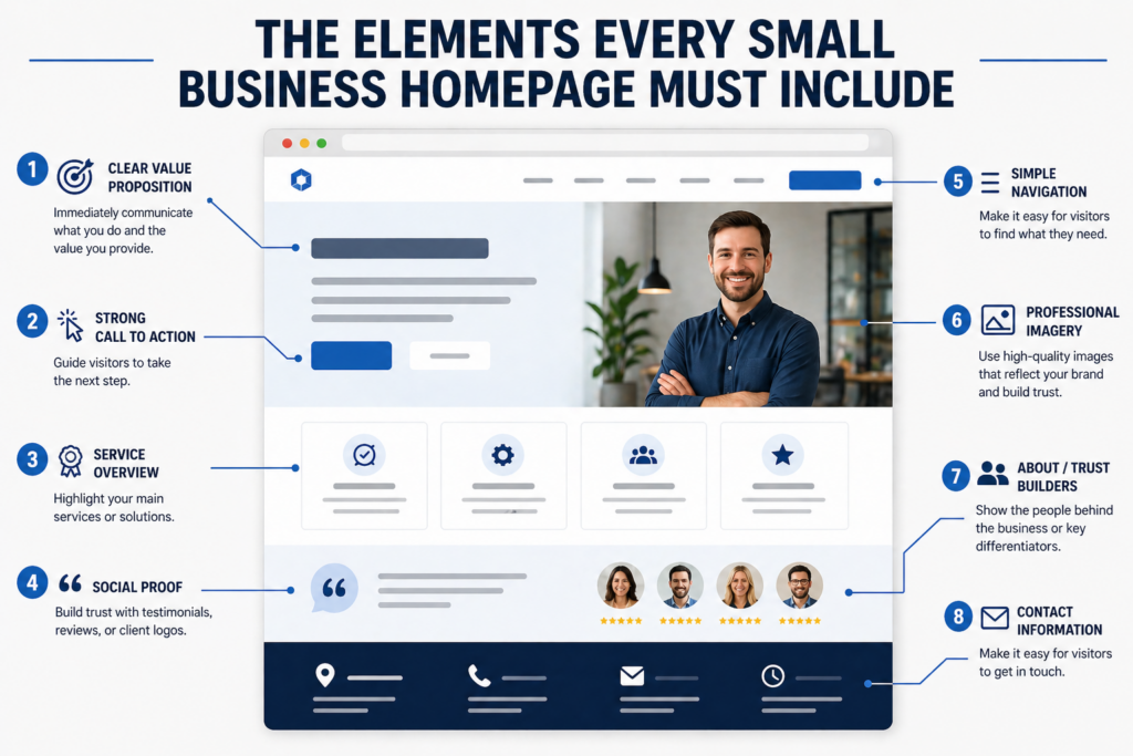
1. A Clear Headline That Immediately Communicates What You Do
The first thing a visitor sees when they land on your homepage should be a headline that answers the question “what is this business?” in plain, direct language. Not a tagline. Not a mission statement. Not a clever phrase that makes sense only once you’ve been on the site for a few minutes. A clear, simple statement of who you are and what you do.
Example of what doesn’t work: “Elevating Your Brand to New Heights”
Example of what does: “Custom Website Design for Indianapolis Small Businesses”
A supporting subheadline beneath it can add context — who you serve, where you operate, what makes you different. But the headline has to earn the visitor’s attention first.
2. A Strong, Prominent Call to Action
A call to action (CTA) is the button or link that tells a visitor what to do next. It should appear high on the page — ideally in the hero section, before the visitor has to scroll — and it should be specific. “Contact Us” is vague. “Get a Free Estimate,” “Book Your Consultation,” or “Call Us Today” tells the visitor exactly what will happen when they click.
Most effective homepages include a primary CTA in the hero section and repeat it in at least one or two additional places as the page scrolls — because different visitors make decisions at different points. Some are ready to act the moment they land. Others need to read more first. The CTA needs to be there when they’re ready, wherever that moment happens.
3. Navigation That Guides Without Overwhelming
Your navigation menu is the visitor’s roadmap to the rest of your website. It should be simple — five to seven items is the sweet spot for most small business sites. More than that creates decision fatigue and visual clutter. Less than that may not cover what visitors are looking for.
Label pages clearly. “Services” is acceptable; something more specific like “Web Design Services” is better. Avoid internal jargon or creative menu labels that make visitors guess what they’ll find. Sticky navigation — a menu that stays visible as the user scrolls — is a useful addition, particularly on longer pages, because it keeps the path to other pages always accessible.
4. A Services Overview Section
Visitors who don’t bounce from the headline will want to know more specifically what you offer. A services section — typically a brief list or grid of your core offerings, each with a short description — satisfies that need without requiring the visitor to hunt through interior pages.
This section doesn’t need to be exhaustive. Its job is to confirm that you do what the visitor is looking for and to invite them to explore further. Each service item should link to a dedicated service page with full details. Keep the homepage versions short: a service name, two or three sentences, and a link.
5. Social Proof — Reviews, Testimonials, and Results
People trust other people more than they trust businesses. Social proof — in the form of customer reviews, testimonials, star ratings, case study snippets, or client logos — addresses the visitor’s unspoken question: “Can I trust these people?” It should appear on your homepage, not buried on a separate “Testimonials” page that most visitors never find.
The most effective testimonials are specific. “Great service!” tells a visitor nothing. “Indy Blitz redesigned our website and we saw a 40% increase in contact form submissions within 90 days” tells them a great deal. If you have Google reviews or a strong average star rating, displaying that on your homepage adds immediate credibility because visitors recognize Google as an independent, trustworthy source.
6. Contact Information That’s Easy to Find
This one seems obvious, but a surprising number of small business websites make visitors hunt for basic contact information. Your phone number should be visible in the header — ideally clickable on mobile so users can call directly with one tap. Your address (if you serve customers at a physical location), service area, and business hours should appear on the homepage as well, either in the header, footer, or a dedicated contact section.
For local businesses in Indianapolis and across Central Indiana, this visibility also supports local SEO. Search engines use consistent name, address, and phone number (NAP) information to verify your business’s location and relevance to local searches.
7. A Human Element — The People Behind the Business
One of the advantages a small business has over large corporations is that there are real people behind it. A brief “who we are” section — even just a few sentences and a team photo or founder image — builds a connection that faceless businesses can’t replicate. It reminds visitors they’re dealing with people in their community, not a faceless entity.
This doesn’t require a lengthy about section on the homepage. A short paragraph, a genuine photo, and a link to your full About page is often enough to humanize the business and build the kind of trust that moves people from browsing to contacting.
What Does “Above the Fold” Mean — and Why Does It Matter So Much?
“Above the fold” refers to everything visible on the screen when a page loads, before the visitor scrolls. It comes from newspaper printing, where the most important story ran above the physical fold of the paper. On a website, it’s the first impression — what a visitor sees in the first one to three seconds before they’ve made any decision about whether to stay.
Your headline, your primary CTA, and at minimum a strong visual or subheadline should all appear above the fold. If a visitor lands on your homepage and can’t tell within three seconds what your business does and what you want them to do next, you’ve lost a significant percentage of them before they’ve ever scrolled. The above-the-fold area is the most valuable real estate on your entire website — treat it accordingly.
Mobile Performance and Page Speed Are Non-Negotiable Homepage Requirements
Two technical elements belong on this list alongside the content ones: mobile responsiveness and page load speed. Together, they determine whether the homepage you’ve built actually works for the people visiting it.
More than half of all web traffic now comes from mobile devices. A homepage that looks great on a desktop but breaks on a phone — with text that’s too small, buttons that are hard to tap, or images that don’t resize properly — is failing the majority of its visitors. Mobile responsiveness isn’t a bonus feature; it’s a baseline requirement for any website built in 2025 and beyond.
Page speed matters for similar reasons. Research consistently shows that visitors expect pages to load in two seconds or less, and a significant portion will leave a site that takes longer than three seconds to load — regardless of how good the content is. Page speed is also a direct Google ranking factor. A slow homepage costs you both visitors and search visibility simultaneously.
At Indy Blitz, every site we build is designed mobile-first and optimized for fast load times from the ground up — because a beautiful homepage that doesn’t perform for the people actually visiting it isn’t serving your business.
What Are the Most Common Homepage Mistakes Small Businesses Make?
After building and optimizing websites for Indianapolis businesses since 2009, we see the same homepage mistakes come up repeatedly. The most costly ones aren’t design failures — they’re strategic ones:
- Leading with “Welcome to our website” — This fills the most valuable space on the page with a statement that tells visitors nothing about what you do or why they should care.
- No clear primary CTA — Visitors have no obvious next step, so most don’t take one.
- Trying to say everything at once — Overloaded homepages with too much text, too many images, and too many competing messages leave visitors confused about where to focus.
- Hiding contact information — Phone numbers buried in footers, or contact pages that require multiple clicks to reach, create unnecessary friction.
- No social proof visible — Businesses that have excellent reviews but don’t display them on the homepage are leaving trust-building opportunities unused.
- Designing for desktop only — Forgetting that most visitors are on their phones when they first encounter your business.
Every one of these is fixable — and fixing them typically has a measurable impact on how many homepage visitors take the next step toward becoming a customer.
If your current homepage is missing any of the elements covered here, or if you’re not sure how it’s actually performing, we’d be glad to take a look. Indy Blitz offers web design consultations for Indianapolis-area businesses at no obligation. Call us at (317) 653-6567 or reach out through our contact page — we’re here to help you build a homepage that works as hard as you do.
Frequently Asked Questions About Small Business Homepage Design
How long should a small business homepage be?
There’s no universal answer, but most effective small business homepages cover the essential elements — headline, CTA, services overview, social proof, and contact information — without exceeding what’s necessary. For most service businesses, this lands somewhere between one and three scrollable sections below the hero area. The goal isn’t length; it’s making sure every section earns its place by moving the visitor closer to taking action.
Should a small business homepage have a lot of text?
Homepage copy should be concise and purposeful. Long blocks of text rarely get read on a homepage — visitors scan rather than read in full. Short paragraphs, benefit-focused language, and visual breaks (images, icons, section dividers) keep the page readable and the visitor moving through it. Detail belongs on interior service and about pages; the homepage’s job is to orient and direct.
How many CTAs should a homepage have?
One primary CTA that appears prominently above the fold and is repeated two or three times as the page scrolls is a strong approach for most small business homepages. All CTA instances should point toward the same primary action — typically calling, booking a consultation, or requesting a quote. Multiple competing CTAs pointing to different actions dilute focus and reduce conversions.
Does my small business homepage need video?
Video can be effective — particularly a short hero video or a brief “about us” clip that humanizes the business. However, video is only beneficial if it’s high quality and doesn’t slow the page down. A poorly produced video or one that auto-plays loudly can do more harm than good. If you’re going to use video, keep it short, mute autoplay audio, and ensure it’s optimized so it doesn’t impact load time.
How often should a small business update its homepage?
Homepage content should be reviewed at minimum once or twice a year to ensure it reflects current services, accurate pricing ranges, updated testimonials, and any business changes. Beyond that, ongoing refinements based on how visitors are actually behaving — which CTAs they click, where they drop off, what content they engage with — are valuable whenever data supports a change. A homepage is never truly “finished”; it’s an asset that should improve over time.